It’s World Cancer Day. So, let’s talk about cancer!
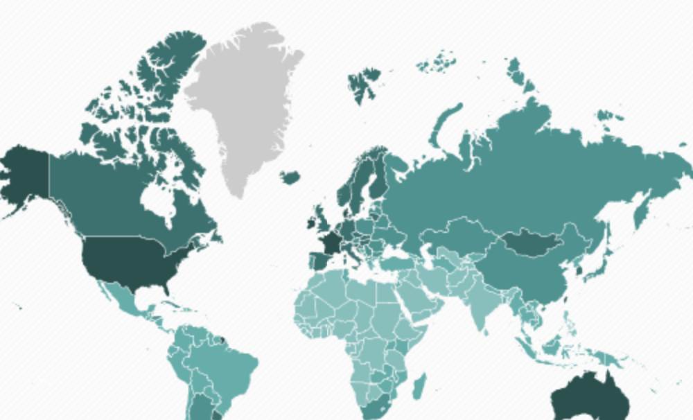
The first two maps come via PRI’s The World. It shows the number of new cancer cases, annually per 100,000 people. Darker green indicates more cases.
As you can see, the USA is still a global leader here, at a rate of over 300 new cases per 100,000 people.
But high cancer rates in the USA and other wealthier countries around the world do not as often have the same deadly consequences as they do in the developing world. In fact, over 70% of cancer deaths occur in the developing world, even though cancer cases are proportionally fewer than in the wealthier world.

Why?
The answer generally comes down to health systems with inadequate resources to diagnose and treat cancers. The International Atomic Energy Agency, best known for sending nuclear inspectors to places like Iran and North Korea, also has in its mandate the development of peaceful uses of nuclear technology. That includes radiation therapy for cancer patients. And here, the IAEA helps countries in the developing world establish cancer treatment centers. But the resources they have to do this job are a far cry from what’s needed. This map puts that the huge gap in stark relief.
Until those gaps are filled, we can expect cancer to be particularly burdensome in the developing world.