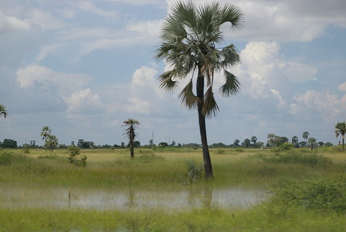
(Flooding in Namibia. Photo credit: potjie)
The Australian government recently issued their 2009 report on climate change, subtitled “Faster Change and More Serious Risks.” Australia is the developed country being hit hardest by climate change – currently in the form of prolonged drought – so they have a special interested in the topic. It’s a grim report.
You might have guessed from the subtitle – the major point of the report is that change is happening faster than predicted. While many uncertainties in the science remain, they all point to faster change. There is no hope that climate change will slow down, or even conform to previous models. We are also on the verge of irreversible long-term feedback loops, after which there will be nothing we can do to stop the changes. None of that is new, but they’ve got an impressive array of data backing up their conclusions. New to me was a genuinely terrifying graph demonstrating we can go back a thousand years and still never see average temperatures like what we’re seeing now.
As though to confirm the conclusions of the Australian report, we have three major flooding situations currently going on. In Benin, 20,000 people have been displaced by heavy flooding along the Southern coastline. Namibia’s cereal harvest is down by 60% because of flooding, and half a million people fled their homes in Assam, India, because of early onset of monsoon season. In every case, observers are reporting that the floods are earlier in the season and more severe than ever before.
Welcome to the future.