Today is World Refugee Day, an annual commemoration on June 20 for the global humanitarian community to shine a spotlight on the plight of refugees worldwide. To mark the day, the UN Refugee Agency released its annual Global Trends of Forced Displacement report which compiles statistics related to refugees and displacement worldwide.
And the data are…staggering.
At 65 million, there are more refugees in the world today than at anytime since World War Two. And the pace of displacement is accelerating.
Since 2011, when UNHCR announced a new record of 42.5 million forcibly displaced people globally, these numbers have risen sharply each year, from 45.2 million in 2012 to 51.2 million in 2013 and 59.5 million in 2014. This is an increase of more than 50 per cent in five years. For comparison’s sake, the report notes that the global population of displaced persons is more than the population of the United Kingdom.
This chart depicts the number of refugees and displaced people in the world for the past 20 years.

The report also contains other interesting and shocking data points. For example, when broken down by number of refugees per capita, the tiny pacific island country of Nauru is the third-largest host of refugees, after Lebanon and Jordan. Nauru has a population of just 10,000, and for the past three years, under an agreement with Australia, refugees who arrive by boat to Australia have been deported to Nauru.

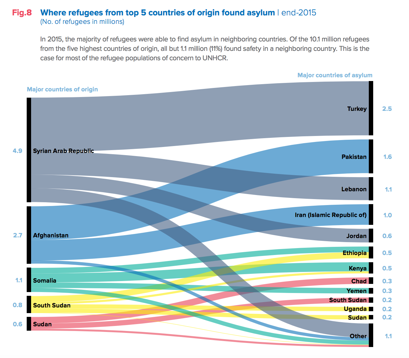
And this chart shows where refugees from the top five origin countries have found asylum. Though it’s not much in the news, Pakistan and Iran are key sources of asylum for Afghan refugees.

The entire report is well worth a read.